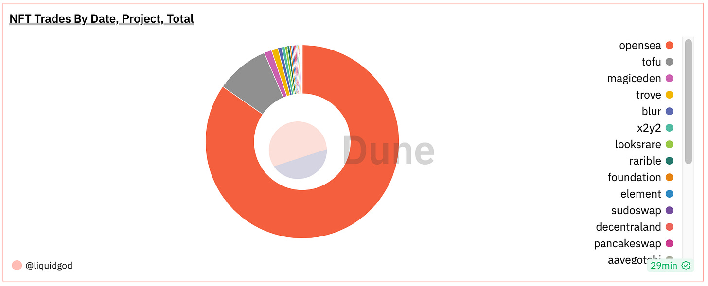
The Dune public dashboards contain a wealth of information due to its open nature. By looking into the visualizations (and their queries) used on those community dashboards, you can greatly speed up building your own.
However, it might not be clear how to build your first dashboard visualization.
In the previous Dune dashboard post we discussed building your first dashboard (and the queries to go with it). Now we will expand on those concepts to add visualizations.
The Basics
A general reason to use any visualization is to detect trends in the data.
Not all visualizations are charts (pie, line, etc). Tables and counters are both visualizations as well. A chart is a specific visualization of data using visual components such as lines, bars, etc. A graph is a specific type of chart over the X and Y axis.
Building a visualization in Dune involves converting your DuneSQL query output into a format that can be used by the “Result data” inputs that are relevant to your specific visualization(s).
NOTE: Not all data returned by a query is required to be used by a specific visualization. More broadly, a query’s results can be partially used in one visualization, and partially in another (or even completely and maybe just visualized a different way).
Building the Visualization
Query
In Dune you can:
Create a query and visualization first and then add to an existing dashboard…
Or, create the dashboard first and later add your query results and visualizations.
In this example we are going to build the visualization seen in the intro picture above. This visualization will show us, how many NFT trades per day, by project, over the past two weeks.
This query is how we will get the data:
select
    date_trunc('day', block_time)   as date,
    project, sum(amount_usd)        as usd_total_per_day,
    count(*)                        as total_trades_per_day
from nft.trades
where block_time > now() - interval '14' day
group by 1,2
order by 1,2
limit 1000
Some quick notes on the query:
As we want to group by day, we pull the day out of the date (block_time) of the transaction via
date_trunc.We want to go back two weeks, so we use now() to get time we run the DuneSQL query and then subtract 14 days from its result. As
now()returns a timestamp, we use "interval ‘14’ day” to generate a corresponding timestamp of 14 days, and then subtract it from the value fromnow(). This is how we go back two weeks in the data.
You can find more about DuneSQL in the official documentation.
Visualization
Now that we have the query we want to use, lets build a pie chart. Again, we will not use all the data from the query. In fact, the query itself is maybe not ideal to your use case, its merely to show a beginners example on what can be done.
In the results from the query, you will see line items in the Query results table. Each represents the transactions activity by date (going back two weeks), with the sums of both amount of trades per project and total USD per project on each day.
The first step to adding this pie chart to the dashboard is to click “New visualization” then select Pie chart as seen below:
The default pie chart (and often other visualizations) will not look correct due to simply defaulting to the initially returned fields in your query results. The next step here is to set the “Result data” to the correct fields for your desired outcome. In this example we want to show the sum of activity over the past two weeks by project. To do this, we will define our slices (X column) to be project, and set Y column to be the total_trades_per_day.
From this point, we can add it to a new or existing dashboard. In my example I will add to an existing one that already has a line chart visualization using the same query as this example. Click the “Add to dashboard” and search for your existing dashboard (or click “New dashboard” if you do not have one) and click the “Add” button on the right.
Once the text updates to “Added”, click “Done”.
From here you can navigate to your Dashboard via the Library button on top of the screen.
In my example I navigated to the “NFT Trades by Date Project Total” dashboard, and edited it, to move (drag and drop) the new pie chart from below my existing line chart, to the right of it as seen below:
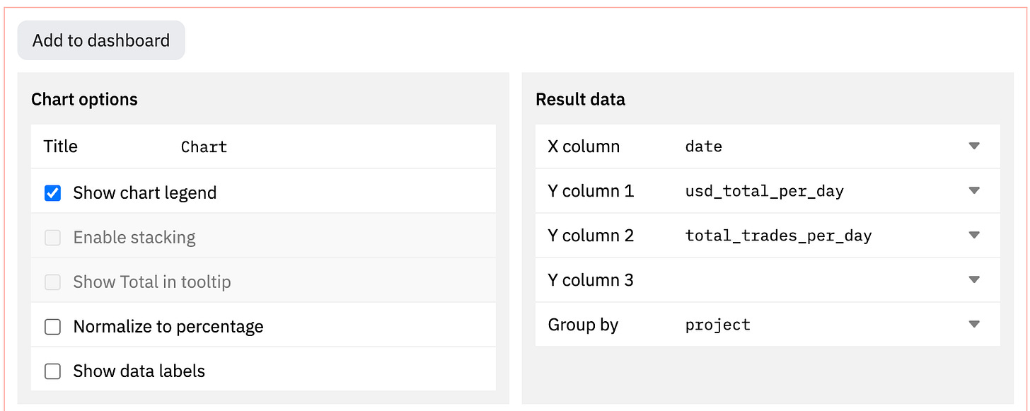
The “Line chart” to the left is utilizing the same query as our pie chart, except its “Result data” configuration is slightly different (so we can see the results by day over past two weeks for both transaction total and total USD per day when you hover over a line). Here is that configuration:
Wrap Up
There are many configuration options available on each visualization type. There are also additional features on the dashboard itself while editing it. The Dune docs are a wealth of information on these details.
Dune visualization documentation can be found here.


